
by Editor
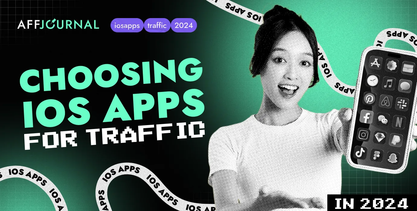
Choosing the right app for iOS users in gambling is crucial for achieving a 200% ROI right from the start without unnecessary testing. The user's first interaction with the app in the App Store is the most critical stage when launching advertising campaigns. Top slots in the design, bright colors, and attractive elements that "warm up" users before downloading and making their first deposit (FTD) can improve traffic quality. Will the user download the app? Will they make a deposit? Will they delete the app after making an FTD?
The aggressiveness of the cover design, the icon, the name — these all influence the CR% of your combination, but let's go through everything step by step!
In this article we are going to discuss:
- How to choose converting iOS apps;
- Which color design elements are key in creating the desire to download the app and perform the target action;
- How the "aggressiveness" of design can be used to create an emotional response that meets the expectations of the target audience, and how these elements help transform simple browsing into active action — downloading the app. Let's go!
Key design elements for attracting traffic
Elements within the color scheme of the setting/offer
The first impression from the visual components of the app plays a crucial role in attracting and retaining the user's attention, and subsequently, in achieving the main goal — downloading the app. This impression should be not only visually appealing but also emotionally charged. The goal is for the user to immediately feel the excitement, thrill, and anticipation of wealth, which are key elements of gambling.
Bright, vibrant colors such as gold, red, or bright green can attract attention and evoke strong emotions. These colors are associated with wealth, energy, passion, and luck, making them ideal for creating an atmosphere of excitement and opportunity. However, these should complement the main colors of the setting/offer.
Even on a psychological level, bright and lively colors prompt users to take action. For instance, gold, often used in slot design, symbolizes wealth and success, instantly evoking associations with big wins and luxury. Red, on the other hand, elicits feelings of excitement and thrill, while green can remind users of money and luck.
*The color palette should match the setting, and the colors and their contrast should evoke positive emotions.
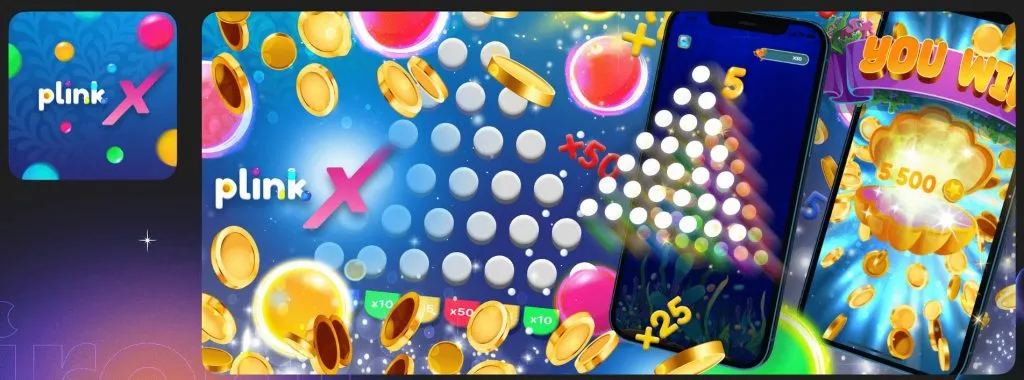
A vivid example: How to transform a rather limited color palette, such as that of Plinko, into a richly diverse application using various colors that will only enhance the user's desire to download the app.
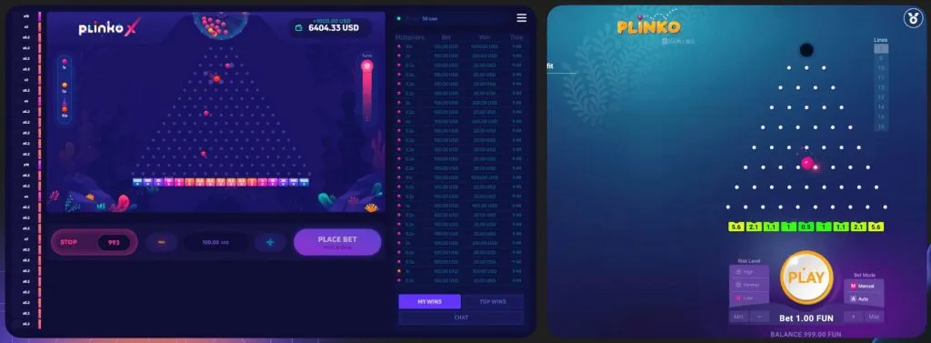 Original PLINKO product
Associative elements of the setting
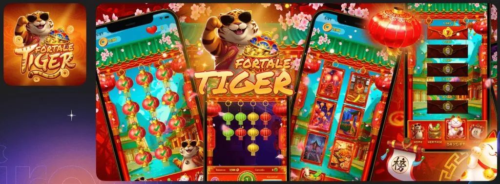
When users see familiar elements such as game mascots (for example, in "Gates of Olympus", "Big Bass Bonanza", "Fortune Tiger") or key symbols (like the sugar bomb in "Sweet Bonanza" or the book in "Book of Dead"), it instantly triggers associations with the original slots. These elements act as visual hooks that remind players of previous positive experiences and increase interest in the new application. Such elements serve not only as visual landmarks but also as symbols of quality and reliability, especially when associated with popular and successful games.
*It’s important to note the emphasis on associative elements specific to a slot/offer.
Enhanced elements to increase conversion
Elements to strengthen emotional undertones
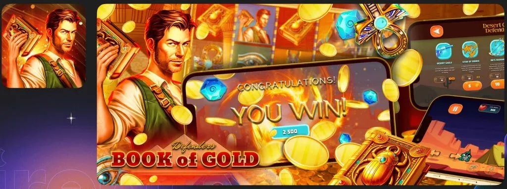
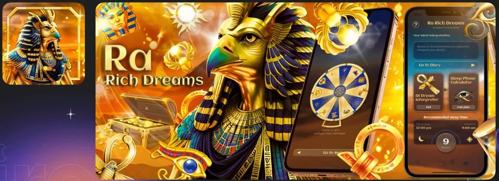
Elements such as coins, treasures, sparks, and glows carry symbolism of wealth and success. They are associated with big wins and achievements, attracting players seeking excitement and opportunities to win.
*The application and its cover should evoke positive emotions.
Premium elements: maximizing response
Personalized approach
Customizing the design elements of the "placeholder" specifically for each slot: visualizing the game field considering its unique features, showcasing big wins, screenshots of bonus games that directly evoke a sense of excitement and anticipation of success for the user.
According to App Store guidelines, developers are required to showcase screenshots from the actual application on their banners. Statistics show that "Apple earns more from the App Store than Google does from Google Play because users trust Apple more, knowing that Apple rigorously controls quality".
This tells us that if a user sees actual screenshots of the app that resemble a slot game on the first screens of the banner, their desire to download the app will increase, making it more likely that they will download the app and proceed to the offer. Therefore, vibrant screens symbolizing the game field similar to a slot, winnings, and bonuses will serve as a trigger for a significant portion of users to download the app.
*Pay attention to the presence of aggressive placeholder screens — does the placeholder itself contain content similar to slot games and gambling in particular? This could include a field scattered with tiles, a screen showing a big win, a fortune wheel, or a welcome bonus. Abstract compositions of elements are good, but in combination with real aggressive placeholder screens resembling gambling games, the conversion rate will be higher.
Direct references to slots
Among all placeholders in the store, it's quite challenging to find applications with aggressive direct undertones. For example, strong impact on users can be achieved through imitation of the original slot game field in design or a fortune wheel, if we're talking about Crazy Time.
*Direct references to gambling games in design will bring you maximum response.
Analyzing designs using the example of the most popular setting Sweet Bonanza
Let's analyze two applications using the example of the most popular setting, Sweet Bonanza. First, it's useful to understand why it's so popular. The slot is themed around candies and fruits, which are visually appealing due to their bright, vibrant colors and playful design.
Similar sweet themes often evoke feelings of nostalgia and joy in users, reminiscent of childhood candies and games. So, let's examine two designs, both similar and different from each other:
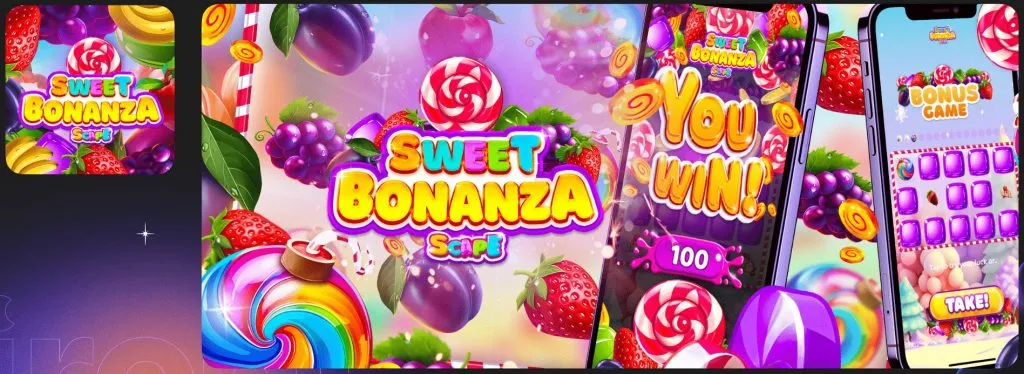
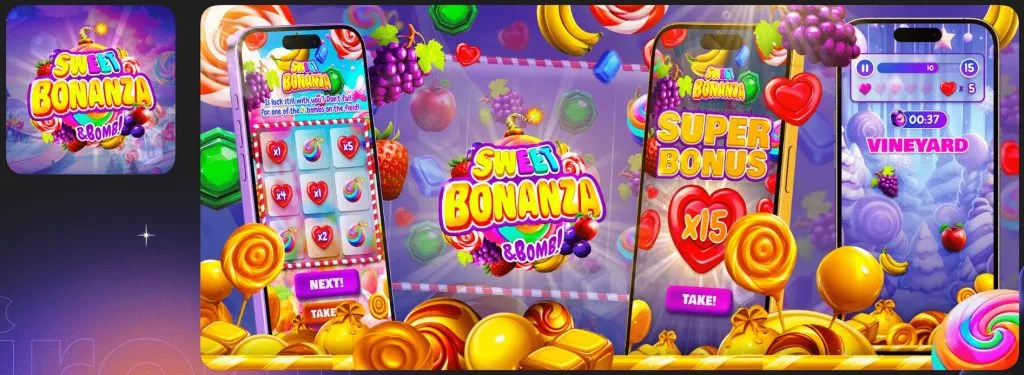
- Bright and memorable design within the color scheme of the setting/offer
Contrasting colors, a bright, juicy, and saturated color palette that evokes positive emotions and is associated with winning;
- Associative elements of the setting
Emphasis on key design elements such as bonus symbols (multicolored bombs, candies), ensuring an emotional response. They serve as bonus elements in the slot, being the most desired and explosive. This gives the design a higher conversion when traffic is launched;
Abundant use of fruits and berries similar to elements in the original slot;
- Attractive name
The name directly relates to the original slot theme. This creates a strong association and recognizability;
- App icon
The app icon serves as the user's first contact with the product. It sparks interest and trust, while also being associative with the original slot;
- Refined logo
A logo embodying the slot's style, featuring multicolored letters with a golden emphasis on the word "Bonanza";
- Additional visual elements strengthening emotional undertones
Sparkling and shimmering elements intensify the feelings of joy and celebration;
- Demonstration of the placeholder itself
Aggressive screens symbolizing wins and screens with game fields reminiscent of the slot enhance user trust in the downloaded application;
- Enhanced associative series and direct reference to slots
The background showcases a classic slot game field, strengthening the connection with the original game.
Such an approach in designing two applications over 2-3 months has demonstrated a high conversion in practice – "click/install = 1/7". This means that every seventh user who visits the App Store decides to download the application. This is a good indicator of the success of the design and marketing strategy. However, Sweet Bonanza Scape performed slightly better because its logo is more strongly associated with the original game.
Conclusion
Analyzing the design of a gambling application and correctly using key visual elements can significantly impact the success of your advertising campaign. The points discussed in this article will help you not only attract the attention of potential users but also retain their interest, thereby increasing conversions and overall user engagement.
Understanding and applying these design elements correctly is crucial for achieving high results when driving traffic.
But remember, design extends far beyond the application itself. It encompasses all aspects of advertising campaigns, including creatives, pre-landing pages, and other marketing tools. Effective design evokes emotions, stimulates excitement, and anticipation of big wins. Using images of real people experiencing joy from playing casino games in motion creatives helps create a strong emotional connection with the audience and emphasizes the thrilling experience offered by the app.
Rent our vibrant and high-converting apps and boost your conversion – contact the IRENT team.
by Editor
comments ....(0)
Leave a comment
You must be in to leave a comment