

by Editor
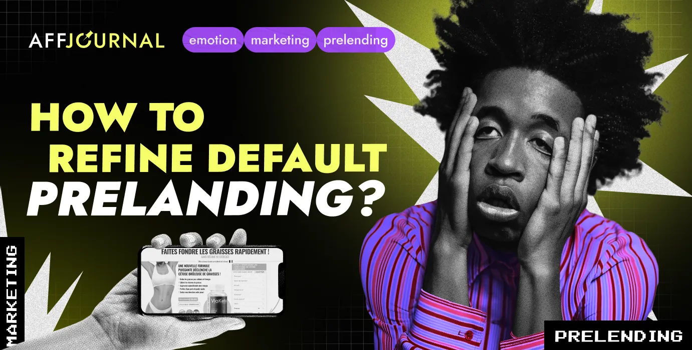
Should you test the "default" pre-landing pages from the affiliate network or "tweak" them? In my opinion, it's a classic "chicken or egg" question. What is the task of an arbitrageur? To capture the buyer's attention, maintain and warm up their interest until the "thank you" page. To evoke and sustain EMOTIONS — to manage the buyer's emotions, after all 😉
What's wrong with default pre-landing pages?
Do affiliate programs sabotage and provide non-converting pre-landing pages to webmasters? Nonsense… Pre-landing pages are tested. Of course, it's impossible to "catch" the promotion method, the level of ad campaign optimization, testing budgets, and ad campaign settings. Naturally, a part of the target audience has already "met" with these pre-landing pages.
Conclusion and task — quickly, simply, and almost "for free" tweak and personalize the default pre-landing page. Is it possible? Here's my take on this issue...
Let's break down the pre-landing page into parts: texts, images, contact form, reviews — that's basically it…
What can I "tweak"?
Photos? Yes. Choose different ones, work on the quality. Everyone knows that. Texts? Of course, you just need to be a copywriter and a native speaker for the target GEO 😉. It's better not to mess with the pre-landing texts too much, but some things can be adjusted.
You can add triggers that evoke emotions ("wise thoughts", quotes, emotional statements, excerpts from statistics, Wikipedia). Triggers can scare, prod, support, inspire, or get to think. It's all a matter of taste.
How to do this if it's better not to mess with the pre-landing texts? Especially if you aren’t very familiar with coding.
Popup windows. They're on many websites. Why not on affiliate sites? Haven't seen it — too complicated? What if it were a quick-change "part"? Take it and "whipped up" such things ("whipped up" sounds cool, but I really racked my brains over it). As a result, a line of code is added to the pre-landing code in the right place, a script is connected, and voila—the user scrolls the page, and this pops up.
Video – a popup with a model sitting. Or something like this…
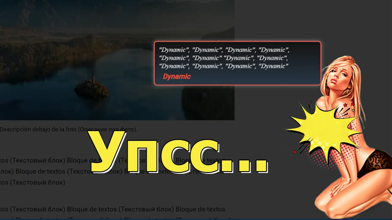
YouTube said Oops… (Watch the edited video via this link).
Spicy details are blurred, but that's on YouTube😉. More details are here. Cool? Emotional? Attractive? I think YEAH... With adult content and potency products, the imagination can be boundless😂, but you can also enhance the medical or influencer approach. The opinion of a doctor or an influencer is almost a directive for the vast majority of the target audience.
Here you go — "popup with a doctor." The popup with a doctor includes several text blocks with different animations and a comparison of "products" in the form of an animated graph. The last block can make a summarizing conclusion with a call to action. It's almost like "live" communication.
When the popups appear, the screen darkens, ensuring that the message grabs the user's attention. You can change the images and text and use it for different offers.
Video – "popup with a doctor"
Is this interesting? Does it make the pre-landing page unique? Does it hold attention? Most likely — YES... Another aspect that seemed "narrow" to me in pre-landing pages is the collection of "Before/After" photos and variations on this theme (photos showing the appearance "issues" in nutra). Such collections are on almost every pre-landing page. Is the information important? Yes. Is it overused? Maybe. But one undeniable point is that on mobile, this block takes up several screens, causing users to scroll through it and potentially lose interest in the process.
What to do?
Automatic slider. Photos appear out of nowhere. The required text is displayed, and the photos automatically change. No need to scroll — just be lazy and get the information.
Video – automatic slider
Results?
- User convenience — no "canvases" of photos. Photo selections can be shown in portions — a couple of photos here, a few photos there.
- You can increase the amount of information provided and avoid creating a monstrous pre-landing page in terms of volume.
- The printing text enhances emotions and changes the perception of information.
Nothing changes drastically, but the information will be delivered in full, with a slight emotional push.
An unexpected scenario that changes emotions! Want to bet? 😉
What else can we "tweak"? 😂 Contact form. I noticed a few areas for improvement. The usual sequence of site blocks is: header, title, content, contact form, reviews. The traffic is mostly mobile, and the form is somewhat of a barrier before the reviews block.
How to solve the "fence" problem? Hidden contact form implementation. Nothing new, but I haven't seen it on arbitrage sites. Most likely, it's considered too complicated and unnecessary (extra hassle).
Oh, what about the quick-change part? 😅 It's like a whole different story. The typical interaction with the form on an arbitrage pre-lander — click anything, scroll to the form.
I liked another idea – when clicking on a link, button, or image, a modal window with the form pops up.
Video – popup contact forms
Of course, I wanted to tweak the forms a bit (and their "design". "Design" = my own creations, haha). The form code is just one, but the styles are different. The style of the form changes by replacing the CSS file, but this is just the beginning...
Now, you can put a roulette (or whatever you like – doors, bags, boxes) in the modal window, and you don't need to use text to justify the presence of the roulette on a site that has nothing to do with casinos. Click = surprise, and no deception 😂
Video – hidden roulette installation
Interesting? Something new? Yummy? In my personal "crazy" opinion – YES...
And that's not all 😊
I don't know for what reasons, but certainly not out of idleness, I wanted to take all sorts of roulettes up a notch. First, I created a roulette in pure JS. jQuery was just too slow 😂. Second, I fine-tuned the popups saying "You've won a discount". I selected photos for different verticals, added animations, and here's what came out of it.
Video – popups for different offers
Well, isn't it cool? 😊 Don't run away, I haven't finished yet...
So, if the user didn't notice the "fence", didn't click on the form "along the way", and didn't place an order, the "journey" continues in the reviews section. What can we add to it? Texts? We can add something from other pre-landings, but that's not what I'm talking about. EMOTIONS... Why do people read reviews?
- Distrust, uncertainty
- Interest already exists, otherwise they would have "run away"
- Unable to make a decision
What to do? How to proceed? Social proof that someone, somewhere bought the product... EMOTIONS? That's how it's done – it's right, it's normal, etc.
I found a popup with social proof in arbitrage blogs.
Essentially, the idea revolves around a popup block informing that someone purchased the product. For that – a big thank you to the author! But, I wanted to tweak it a bit more as well. 😂
In the original version, popups with information like "Aunt Dusya from city X bought product NNN" appeared based on timing. It seemed to me more appropriate to use this tool exclusively at the "right" moment.
And when does this "right" moment occur? It seems to me that the most appropriate place is the testimonials section. The user reads the reviews, scrolls through the page, and "almost seamlessly" receives information that "product NNN" is being actively purchased. The text printing script enhances the effect (an unexpected element — changing emotions and, in addition, a new way of presenting information. Almost like the twenty-fifth frame). All the same — a line of code in the right place of the pre-landing page, and off we go!
“Popup” – Social Proof
Conclusions about all these "goodies"?
Is it emotional? Does it attract attention? Is it interactive? Definitely – YES...
All this "beauty", well, or not "beauty" – you decide for yourself, is located right here. You can read descriptions and installation manuals, if you want – buy for self-installation on pre-landings or order installation.
by Editor

comments ....(0)
Leave a comment
You must be in to leave a comment